AI Agent Icon: What It Is and How to Choose One
An AI agent icon can name an agent, mark an AI feature, show live status, or point at a tool. Here is what the common symbols mean, where to find one, and what to check before you ship it.
An AI agent icon can name an agent, mark an AI feature, show live status, or point at a tool. Here is what the common symbols mean, where to find one, and what to check before you ship it.
An AI agent icon is any small graphic that stands in for an AI agent inside a product. In practice it does one of a few specific jobs: it names a particular agent, marks an AI-powered feature, shows the surface you talk to, displays what the agent is doing right now, or points at one tool the agent can call.
Ready-made ones sit on icon libraries and stock galleries. You can also draw one or generate it. Either way, two checks matter most: whether the mark still reads at the size it will actually appear, and whether the licence lets you use it.
The phrase is not a formal category with a specification attached, the way an API or a database has one. It gets used loosely, which is why one person asks for a chatbot icon, a second for an automation icon, and a third for a copilot mark.
Counted by job rather than by subject, the same territory divides six ways: identity, feature, assistant, avatar, status and action. What any of them looks like depends on where it has to work.
| Where it appears | The job the mark is doing | Changes? |
|---|---|---|
| Sidebar or launcher | Identity — which agent is this? | Rarely |
| Chat header | Identity or avatar — who am I talking to? | Rarely |
| Dashboard card | Feature name, with a separate status element | Rarely |
| Chat input area | Assistant — where do I type? | Rarely |
| Workflow builder | Action — a step that runs itself | Often |
| Developer tool or settings | Identity, inside an existing icon grid | Rarely |
| Mobile app | Identity, on a small canvas | Rarely |
| Notifications, docs, favicon | Whatever survives the single size it gets | Depends |
Read the last column twice. The first four jobs are stable, the last two are not. A mark doing a stable job should not be the same mark that flickers between five states, and a mark doing an unstable job should not be the thing telling you which agent you are looking at.
The damage is easy to picture. An agent called Inbox sits in a sidebar next to a green mark meaning working. Later the same green mark appears beside a different agent, because the colour means busy, not Inbox. Now the colour is ambiguous, and so is the sidebar — and the fix is usually a longer label, which is the outcome the icon was supposed to avoid. The mirror problem is quieter. If the mark never changes, a user has no way to notice anything is happening at all, and that is the pull towards a second element for state: a spinner, a dot, a line of text.
This is not just theory. Microsoft publishes requirements for agent icons across Microsoft 365: a 192 by 192 icon for store listings, a 32 by 32 icon for the default app bar state, and an optional 32 by 32 focused icon for the active state. The spec also fixes a 120 by 120 safe area and warns against multiple words, because text stops being readable at 32 by 32.
Two details stand out. The optional focused variant exists because a single mark cannot carry identity and active state legibly, so the platform asks for a second asset. And Microsoft recommends 4.5:1 for its app icons, stricter than WCAG asks for non-text elements — platform specs are often a floor rather than a ceiling. None of it is a general standard. It is one vendor's requirements for one store.
This is where the vocabulary drifts, so it is worth being precise about what each shape tends to carry.
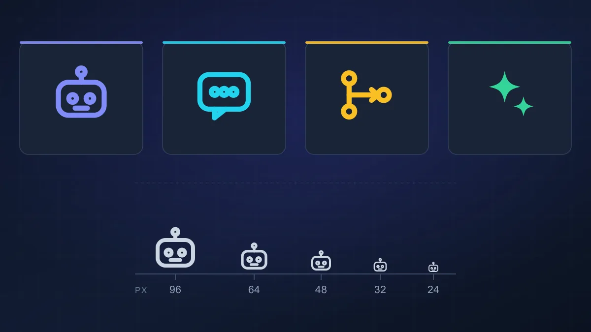
A robot head communicates that the thing is not a person. It says nothing about whether the feature answers questions, runs on a schedule, or can open a file and change it — it is a statement about category, not capability, which is why the same robot file gets reused across half a product.
A chat bubble points at a conversation surface. Put it on a feature the user cannot type into and you have set up a small mismatch every time they go hunting for the prompt box.
A sparkle signals that something is AI-powered or generative. It is efficient because it needs no explanation, and vague for the same reason. A sparkle on a feature that quietly classifies documents does not tell anyone what it does.
A workflow or branch shape suggests automation and orchestration, one thing triggering another. A brain suggests intelligence, and tends to be abstract enough to mean nothing in particular.
None of these are read identically by everyone. Meaning depends on context and on whatever label sits beside the mark, so an icon in a labelled sidebar can afford to be plainer than the same icon alone on a marketing page.
Write the agent's job in a sentence without marketing language, then decide which single job the mark is doing. If it turns out to be two, split them into separate elements now rather than later.
Pick a metaphor that describes the job, not the industry. A research agent can borrow from search, where a magnifier already means looking for something. A coding agent from code — brackets, a terminal prompt, a file. A scheduling agent from a clock. A monitoring agent from a pulse or an alert.
Two things to avoid. Do not let two agents in the same product share a metaphor, or the icons stop telling them apart. And do not reuse a metaphor the product already spends on something else, because a mark that means two things is worse than no mark.
The AI clichés get argued about more than they deserve. Robot heads and neon futurism are not bad — they signal the category with no explanation, which is genuinely useful in onboarding and anywhere the audience is meeting AI for the first time. They fail somewhere else: in a dense interface with forty other glyphs a robot head competes and loses, and a neon treatment that looks convincing in a dark hero section turns to mud at 16 pixels. The opposite mistake is just as common, reaching for something fully abstract because it looks tasteful and then finding nobody outside the design team can say what it means.
A better test than taste: pick the direction that needs the least explaining in the place it will be seen most.
An icon that looks considered at 512 pixels can fall apart at 16. What fails is predictable — fine interior detail, thin strokes, small enclosed gaps, and anything depending on a subtle value difference between two parts of the drawing.
Sizes like 16, 20 and 24 pixels are common in interface work. Those are conventions rather than standards, but they are the sizes that matter, so test there first.
Borrowing an icon from a library means inheriting its grid. Tabler Icons draws everything on a 24 by 24 grid with a 2 pixel stroke, which is a sensible reason its outlines stay even when shrunk and a constraint if your own system is built differently.
There is an accessibility reason to keep strokes from getting too fine. W3C's note on non-text contrast observes that because of anti-aliasing, thin lines and shapes can render much fainter than the colour defined for them, so an element can pass a contrast check on paper and look weak in practice. Thinness is a legibility problem before it is a compliance problem.
Drop the mark into a real sidebar at its real width, into a mobile toolbar, into a notification at the size notifications render, and into a list that already has other icons in it. A mark that works on a white background may feel too faint in dark mode, and something distinctive on its own can become hard to identify once it sits next to twenty other icons.
Screens that look fine in a design file routinely look thin on a laptop in daylight. If you assemble the set in a tool like Figma, judge the exported asset at size rather than the frame on the canvas.
For a product with more than one agent, the levers are fewer than people expect: separate them by role, by accent colour, by shape language, by label, or by keeping identity stable and pushing all change into a separate status element. Colour alone is the weakest, and not only aesthetically — WCAG 2.2 criterion 1.4.1 says it cannot be the only visual means of conveying information. The guidance adds a nuance worth knowing: colours differing in lightness as well as hue, with a contrast ratio of at least 3:1 between them, count as more than one cue, while two colours at the same lightness do not. Strip the labels, and if you can no longer tell your agents apart, the icon set is not doing its job yet.
Contrast against the real background in both themes, an accessible name on anything interactive, and a licence you have actually opened. Both are covered below.
When I'm choosing an icon for an AI agent, I don't start by asking whether it looks impressive. I first try to work out what the icon needs to communicate.
That sounds obvious, but it is easy to get wrong. A robot face might immediately suggest AI, while a chat bubble makes me expect a conversation. A sparkle works as a general AI signal but tells me little about what the agent actually does. If I am looking at an icon inside a real product, I want to understand its role without having to stop and think about it.
Size is another thing I check early. An icon can look perfectly clear in a large preview and then become surprisingly hard to recognise at 16 or 20 pixels. Small gaps disappear, thin lines lose their weight, and details that looked useful at a larger size simply stop contributing anything. That is why I lean toward a simpler shape when the icon is going into a busy interface.
I also look at the icon where it will actually be used rather than judging it on a blank canvas. A mark that works on white may feel too faint in dark mode, and an icon that looks distinctive on its own can become difficult to tell apart once it sits next to ten or twenty other interface icons.
Before using an icon in a product I check the practical side too. I want to know what format I am getting, whether the file scales cleanly, and what the licence actually allows. Those details are easy to ignore while you are browsing icons, and they matter as soon as the icon is part of a website, app, template, or commercial product.
For me the most elaborate icon is usually not the one that works. It is the one that still makes sense when it is small, surrounded by other UI elements, and being used for the exact job it was designed to represent.
These are design examples, not descriptions of anyone's product.
An agent inside a dashboard. A dashboard card has a job, a title, and a status line, and there is very little room. A detailed illustration — a character with shading, a full robot portrait — loses in that space and starts competing with the card's own content. A compact symbol at roughly 24 pixels, drawn on the same grid as the rest of the interface, reads faster and leaves the card calmer. The illustration can live on the agent's own page, where there is space for it.
An AI support assistant. Here a chat-oriented mark is the honest choice, because the user really does type to it and expects a reply. The detail that matters is that the chat shape says conversation, not task execution. If the same product also runs an agent that opens tickets and chases invoices unattended, giving both the speech bubble is where the confusion starts. The conversational one keeps the bubble; the task-running one needs something that reads as action.
An automation or workflow agent. Here a generic chatbot symbol actively undersells what is happening. A branching node or a trigger-and-action shape tells the user something will fire on its own. The robot face is the weakest of the three here, precisely because it only says AI, and automation products are full of things that are AI but are not agents.
Three WCAG 2.2 success criteria do most of the work, and each has a specific scope worth knowing rather than approximating.
Non-text contrast, criterion 1.4.11, level AA. User interface components and graphical objects need a contrast ratio of at least 3:1 against adjacent colours. W3C's worked examples include one that lands exactly here: status icons on a dashboard, without associated text, carry a 3:1 minimum. The ratio is a threshold rather than something to round into, so 2.999:1 does not pass.
Use of colour, criterion 1.4.1, level A. Colour is not the only visual means of conveying information, indicating an action, prompting a response, or distinguishing a visual element.
Non-text content, criterion 1.1.1, level A. Non-text content needs a text alternative serving the equivalent purpose. If it is a control, it needs a name describing its purpose. One of W3C's own test rules is that an SVG element with an explicit role has a non-empty accessible name, which is a direct hit on inline SVG icons carrying a button role.
In practice: an icon-only button needs an accessible name, and a visible label beats a tooltip. A mark that is decorative beside real text can be hidden from assistive technology. A status mark carrying meaning on its own needs the 3:1 check, and in dark mode that check has to be redone against the dark background rather than assumed. Not every icon has to meet every rule — a decorative mark beside a text label is a different case from a status glyph standing alone — and none of this is legal advice. If conformance is a contractual obligation rather than a design goal, talk to someone qualified to advise on it.
SVG is the default for interface icons. It is vector, so one file serves every size, its colour can follow surrounding text through CSS, and it stays editable when several agents share a grid.
PNG is a bitmap with a fixed pixel size, so you export one version per size. It suits app store assets, slide decks, and anywhere a bitmap is genuinely required.
Other formats turn up in narrower situations. Adobe's Express icon maker points at favicons specifically and exports ICO, ICNS or PNG through an add-on rather than treating them as general-purpose choices.
There is no universally best format, and the destination settles it. One caveat: an SVG that depends on an external font or embeds a bitmap is no longer the simple scalable case, so check the file before assuming it will behave.
Anyone searching for an AI agent icon is often one download away from putting something into a product, which makes licence checking the part most likely to be skipped. Look in the asset's own repository or licence file, not on the page where you found it.
The licence type. Tabler Icons is MIT licensed, which permits commercial and personal use, modification and distribution provided the licence and copyright notices are kept. Lucide uses ISC, similarly permissive. Material Symbols is published under Apache 2.0, which additionally grants patent rights and asks that any NOTICE file be preserved.
Attribution. MIT and ISC both keep the notice requirement alive. It is usually a line in a licence file or a comment inside the SVG, and it is easy to drop accidentally when an icon is copied out of a Figma file.
Commercial use, modification, redistribution. Three separate permissions, and free does not mean all three. An icon in your own product, an icon in a template you sell, and an icon inside an asset you redistribute are different asks.
Marketplace terms. This is where "free" and "free for commercial use" come apart most often. Icons8's licence allows personal and commercial use of its graphics for free, and the trade is a visible link back to icons8.com. The Noun Project's terms are more layered: icons come under Public Domain or CC BY 3.0, where free use requires attributing the creator, while photographs fall under CC BY-NC-ND 2.0, which is non-commercial and forbids derivatives. Same site, same word free, two entirely different sets of rights.
One more trap: converting text to outlines does not sidestep a font licence, so if the mark contains letterforms the font's terms travel with it.
Read the licence for the specific asset. Do not treat this article as legal advice, and do not assume anything about an icon whose terms you have not opened.
Verified against their own terms rather than their marketing, and not ranked — these suit different situations.
Icon libraries with open licences. Tabler Icons ships an ai-agent icon among its outline set, MIT licensed, built on that 24 by 24 grid. That single file is a useful lesson: a widely used library covers most of the roles in this article with one mark, which tells you how much of the differentiation work lands on the product team. Lucide and Material Symbols work the same way under ISC and Apache 2.0.
Stock galleries. The Noun Project and Icons8 both have searchable AI-agent collections in PNG and vector, and both let you buy a licence that removes attribution. Expect a link-back or credit requirement on the free tier of each.
Generate or build your own. IconlabAI generates app icons and logos as PNG, and Freepik AI covers prompt-based image generation and vector creation if you want to go further than an asset search.
Licence terms can change between versions, so check the file in the repository you are actually pulling from. And stock galleries are fine places to look for inspiration, but inspiration is not permission.
What is an AI agent icon?
It is any small graphic that stands in for an AI agent inside a product: a name beside an agent, a marker on an AI-powered feature, the surface you talk to, a live status readout, or an icon for one tool the agent can call. The term is shorthand rather than a formal category, which is why one drawing often ends up doing several of these jobs at once.
What is the difference between an AI icon and an AI agent icon?
An AI icon says only that artificial intelligence is involved, and a robot head is enough for that. An AI agent icon implies something narrower: that the system acts on its own by picking steps or tools rather than only replying to a prompt. A robot graphic is a visual convention, not a statement about capability.
Can I use a free AI agent icon commercially?
Sometimes, but only if the licence on that specific asset says so. Tabler Icons is MIT licensed, which permits commercial use, modification and distribution if you keep the notice. Icons8 allows personal and commercial use for free but asks you to link back to icons8.com. The Noun Project licenses icons under CC BY 3.0 while its photographs fall under a non-commercial licence, so the word free covers very different rights depending on which tab you used.
What file format should an AI agent icon use?
SVG for interface use, because one file scales to every size and its colour can follow the surrounding text. PNG when you genuinely need a bitmap, such as an app store asset or a slide. Format follows the destination, and interface icons rarely need anything beyond SVG.
How do I make an AI agent icon accessible?
Check three things. Contrast: WCAG 2.2 criterion 1.4.11 asks for at least 3:1 between a meaningful graphic and its adjacent colours. Colour: criterion 1.4.1 says colour cannot be the only way of conveying information, so pair it with a shape, label or position. Name: under criterion 1.1.1 an icon acting as a control needs an accessible name.
Should an AI agent icon be a robot?
Only where that earns its place. A robot or character suits a playful product, an audience meeting AI for the first time, or a place where you want warmth. It works less well in a dense interface where the mark competes with dozens of other glyphs, and it says nothing about what the agent does. Pick the direction that needs the least explaining where the icon will be seen most.
Get our best AI tool reviews and guides delivered to your inbox each week. No spam, unsubscribe anytime.
Written by
The AI Tools Vault editorial team writes guides grounded in published standards, vendor documentation, open-source licence files and hands-on selection work rather than marketing copy. This article combines first-hand icon selection observations with the W3C WCAG 2.2 success criteria, Microsoft's published agent icon requirements, and the licence terms of the libraries it names.
More reading on guides & how-to
 Guides & How-To
I used several AI budget tools on ordinary budgeting jobs. Here is what saved time, what got filed in the wrong category, how much of the "AI" is really automation, and how to check a tool before you connect a bank.
 Jawad Fiaz
 Guides & How-To
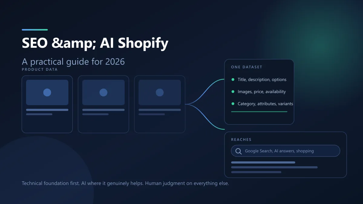
AI channels read the same product fields Google already crawls, so Shopify SEO and AI search are one job rather than two. Here is what the platform handles, what you still own, and where AI genuinely helps.
Jawad Fiaz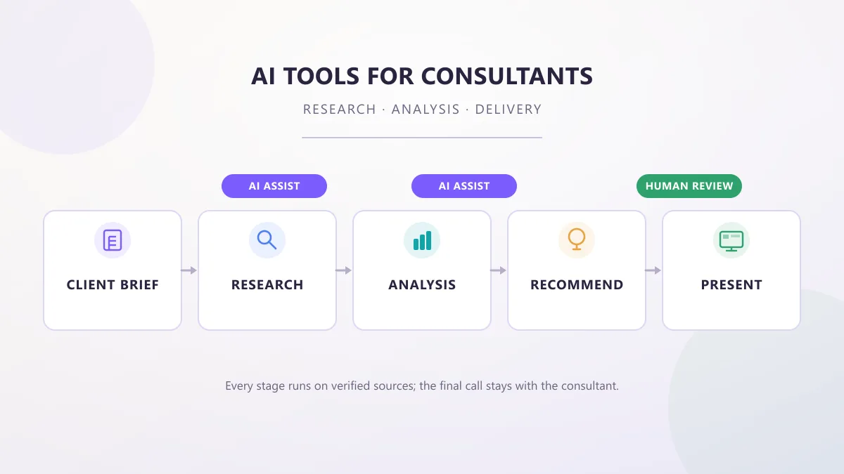 Guides & How-To
AI tools for consultants in 2026, organized by the work a consultant actually does — research, analysis, proposals, meetings, and decks — with practical prompts, workflows, and client-data checks.
AI Tools Vault Team